At least 70% of your traffic will be from users on mobile devices. Is your website built to handle this?
Mobile Readiness Starts with the Right Theme
Choosing the right WordPress theme is foundational to mobile performance. Most modern themes are responsive, but responsive design alone is not enough. Visual layout is only part of mobile readiness — performance is equally critical.
When you test your site using Google PageSpeed Insights, you receive two separate performance scores: one for mobile and one for desktop. These scores are calculated from multiple metrics, including render-blocking resources, JavaScript execution time, layout shifts, and overall page weight. Your theme’s architecture directly influences all of them.
A truly mobile-optimized theme should be evaluated beyond appearance:
- Does it load excessive CSS or JavaScript on every page?
- Does it depend on legacy libraries such as jQuery when modern vanilla JavaScript would suffice?
- Does it enqueue global assets that are not even used on the current page?
- Does it minimize render-blocking resources?
- Does it keep DOM size and layout complexity under control?
Mobile devices operate with more constrained CPU, memory, and network conditions. Overloaded themes increase parse time, delay interactivity, and degrade the user experience — particularly on listing-heavy real estate websites.
Responsive design makes a site usable on mobile. Efficient resource loading makes it fast.
Both matter.
Rover IDX Layouts are mobile-responsive
When you are looking at a page on your table or phone or desktop - this is called the viewport. Mobile phones have smaller viewports than desktops. So websites these days handle this with responsive design - the pages adjust their layout to accommodate the viewport. Rover IDX layouts are already responsive.
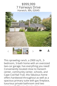
When a page is loaded, Rover IDX knows if the browser is mobile. And if it is, appropriately smaller images are served up - reducing bandwidth and improving page speed.
Lastly, Rover IDX has settings to allow for different experiences on desktop / table / mobile. For example, you can set a different listings-per-page to be displayed on mobile phones.